R/GA Global Rebrand
Before the reset, our brand was telling a design-first story, but the system wasn’t setting people up to deliver on it. We set out to create a brand that keeps pace with our new global positioning (designing businesses and brands for a more human future). A brand that can adapt to social, technological, and environmental advances across channels and continents. We believe the R/GA brand is an operating system. It guides much more than marketing. It shapes the experience, informs business decisions, defines product roadmaps, and inspires a company’s culture. The brand is the thread that builds relationships across a customer’s journey.
Client: R/GA
Role: Creative Direction, Motion Direction
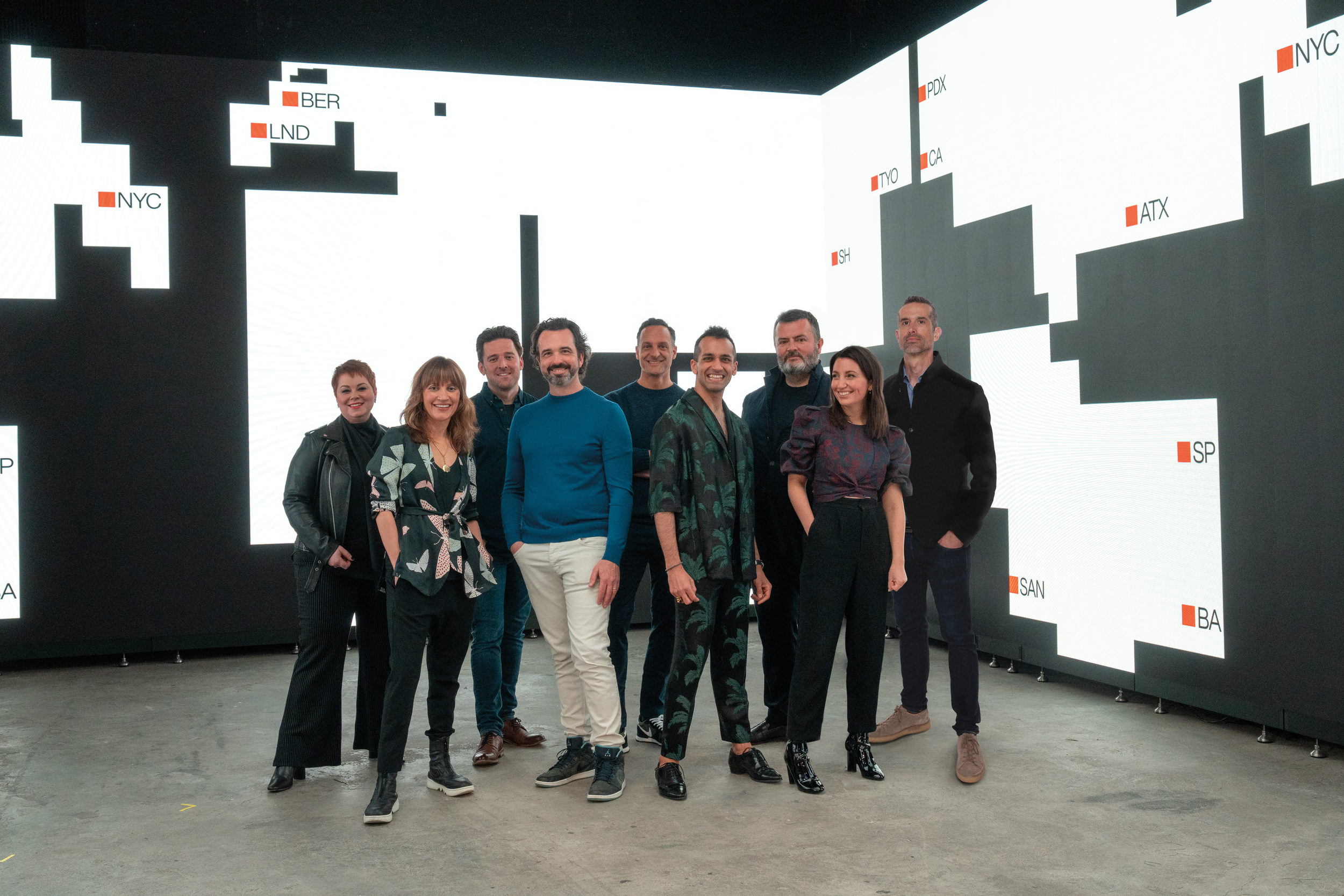
Creative Team: Ben Williams, Lars Hansson, Nikhil Mitter, Andy Wong, Nichloas Karlovich, Bruno Dasilva, Nordanth Munoz, Constanza Falcato, Brittany Messenger, Agustina Carnero, Jon Marsh


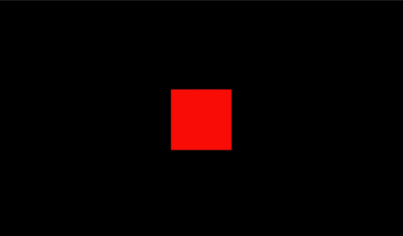
““The R/GA red square was inspired by the Bauhaus red front door....We’re the Bauhaus of Silicon Valley. We are a creatively driven company that integrates technology as it changes and evolves.””


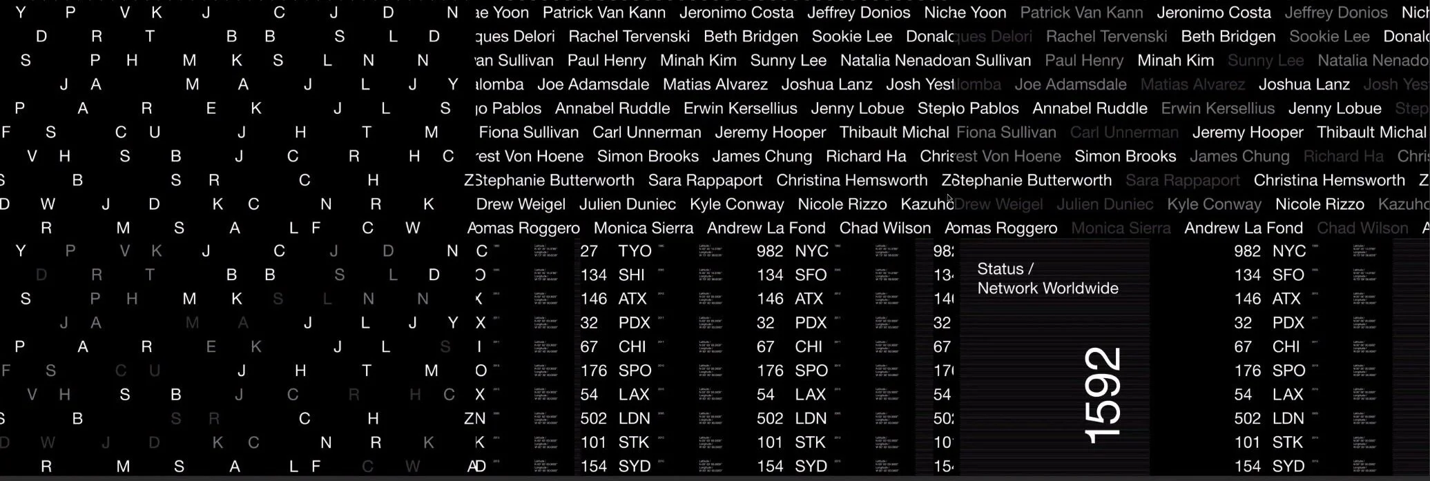
“R/GA’s approach to creative problem solving involves balancing simplicity and complexity through a multi-faceted approach that draws inspiration from the growth at scale observed in fractal geometry. Ultimately, fractal patterns informed the development of the brand’s visual and motion attributes.”


“Rooted in fractal patterns, our grid is a representation of our network—and the universal nature of our work. With a unified, adaptive grid we can make it easier to collaborate across platforms. ”


“The branded graphic language is minimal yet bold. Each element are rooted in simple lines and squares, allowing anyone in the R/GA network to take part in visualizing data and expanding the brand’s graphic library. ”


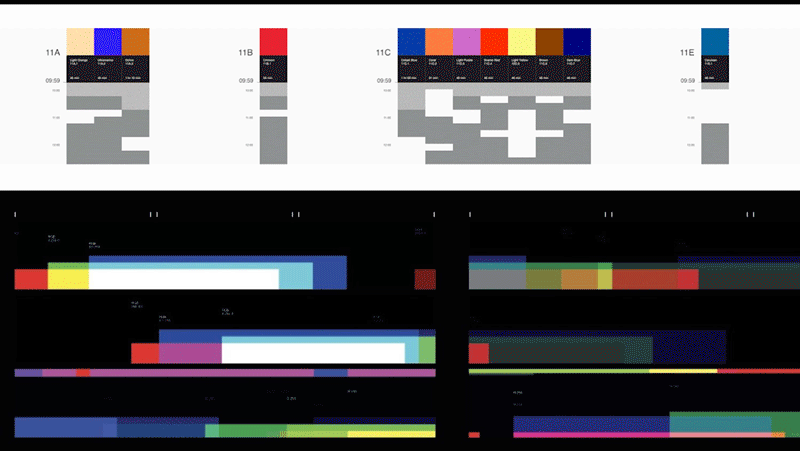


“The system flexes from didactic charts to expressive motion behaviors inspired by fractal geometry. ”
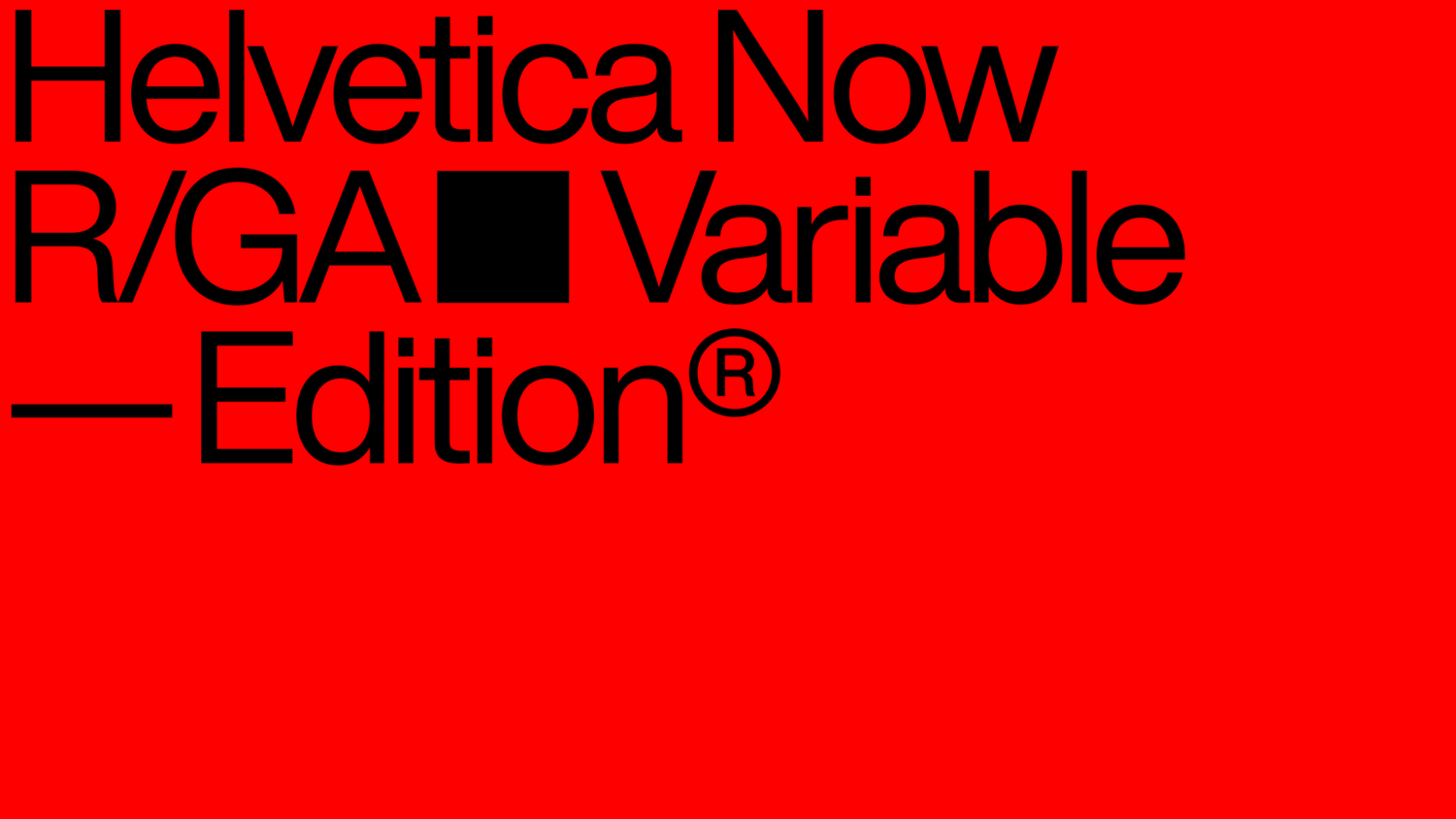
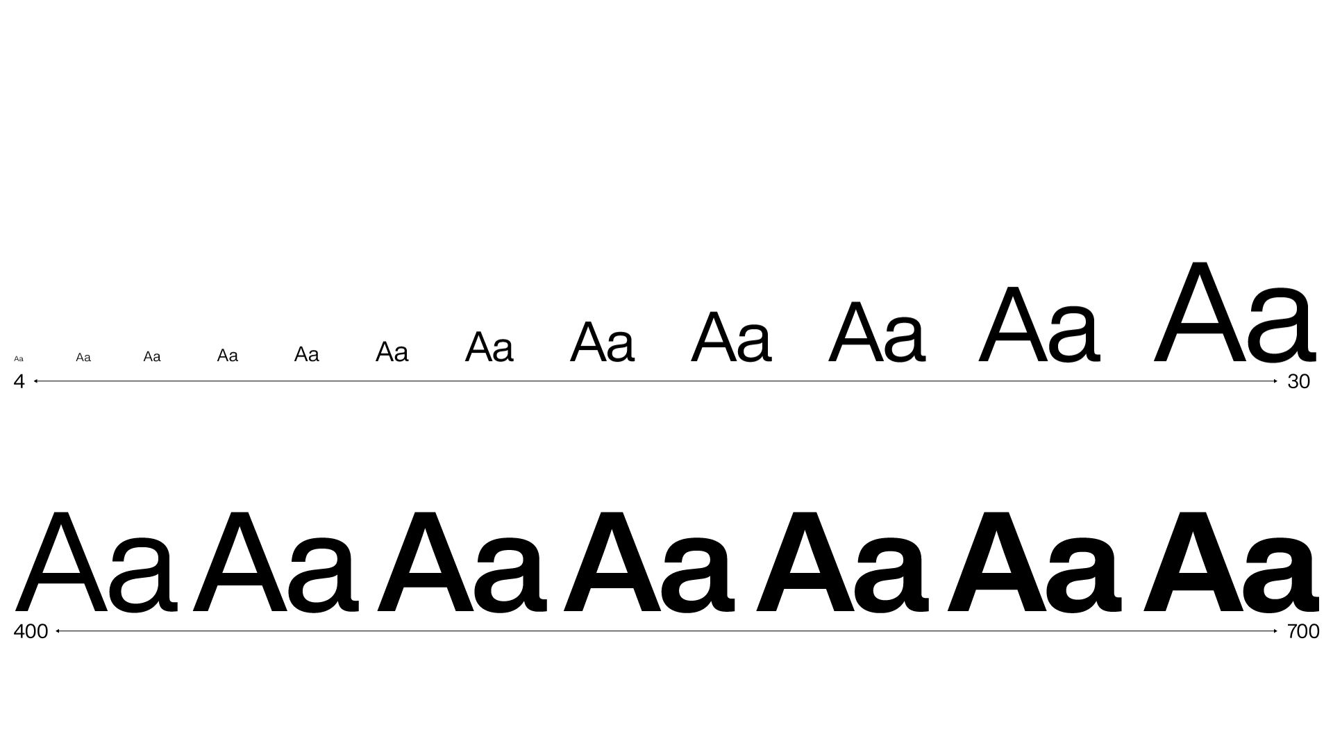
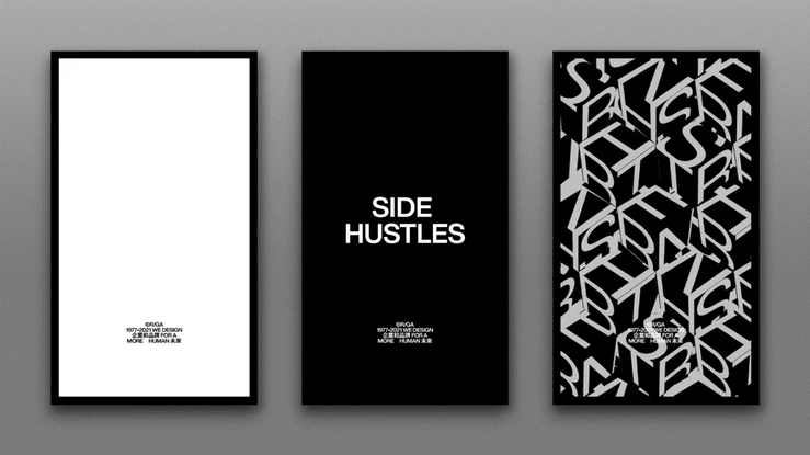
“A modern typographic expression using an evolved typeface that makes us ready for the future, a typeface built for our needs, a typeface built after the birth of the internet, goodbye Helvetica Neue. Hello Helvetica Now. Evolution to handle modern channels. Helvetica Now. Next step: Helvetica Now Variable—R/GA ”


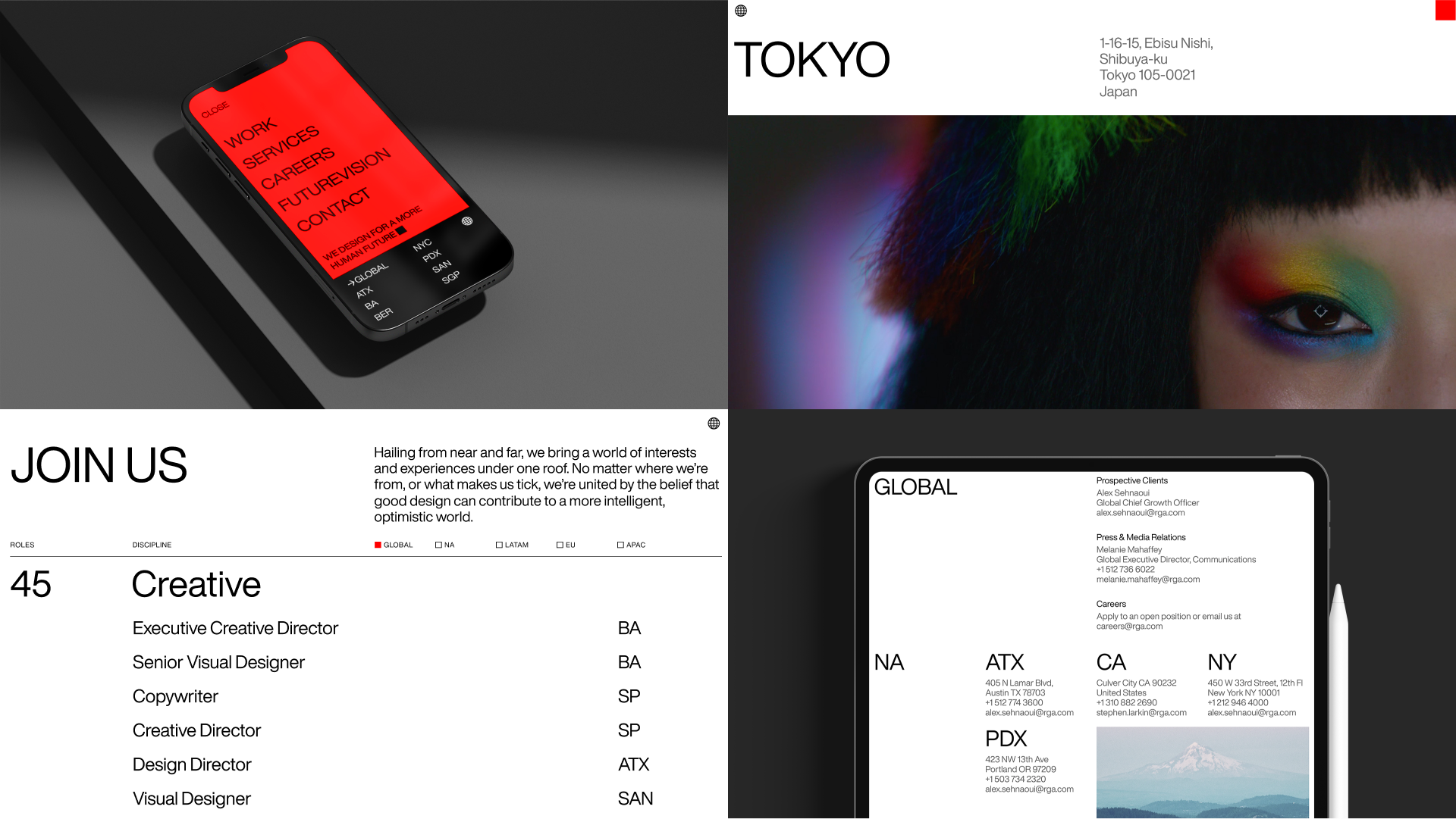
“Designing businesses and brands for a more human future. It starts with our positioning, our role in the world, because brand is an operating system, this statement can’t just be words on a page. It must influence our expression, how we act, and what we create. With a new brand system, we articulate that focus: activating who we are and what we stand for everywhere. ”

“Our evolved brand makes Space for Perspectives. That’s the idea at the heart of our system. It elevates how we bring together design in all its forms, celebrating the differences we bring and the purpose we share. It’s meant to inspire curiosity and innovation as we pioneer a more human future.”


“The welcome kits includes R/GA branded notebooks, hoodies, tote bags, pencils. water bottles.
”


